
In Part 1, we looked at individual factors like school age and ranking to see how they correlated with NAPLEX pass rates. The scatter plots gave us a good “vibe check,” but they left us with a major question: Which of these factors are actually driving the results, and which are just along for the ride?
To find out, we have to move beyond simple observations and perform a multivariable linear regression. Think of this like a clinical trial for data. In a trial, we want to know if a drug works independently of a patient’s age, weight, or other medications. In our regression, we are doing the same thing, but instead of randomizing pharmacy students into two groups, we are statistically adjusting for the other variables all at once to see which ones remain statistically significant. It allows us to isolate the impact of a single factor while holding everything else constant.
It’s time to find out which variables are the true “active ingredients” in a school’s success rate and which ones are just “excipients” in the formula.
Testing the Formula
| 95% Confidence Interval | ||||||
|---|---|---|---|---|---|---|
| Predictor | Estimate | SE | Lower | Upper | t | p |
| Interceptᵃ | 103.5455 | 5.3697 | 92.9238 | 114.1673 | 19.283 | <.001 |
| Program Age | -0.0138 | 0.0217 | -0.0567 | 0.0291 | -0.637 | .525 |
| 1st attempts | -0.0364 | 0.0255 | -0.0868 | 0.0140 | -1.428 | .156 |
| USN Rank | -0.2837 | 0.0388 | -0.3604 | -0.2070 | -7.315 | <.001 |
| R Tier nomiss: | ||||||
| 1 – 0 | -5.6442 | 2.6468 | -10.8798 | -0.4087 | -2.133 | .035 |
| 2 – 0 | -0.3225 | 2.7180 | -5.6991 | 5.0540 | -0.119 | .906 |
| 4 Years: | ||||||
| 1 – 0 | -3.3647 | 2.2686 | -7.8522 | 1.1228 | -1.483 | .140 |
| ᵃ Represents reference level | ||||||
So what are we actually looking at? When we throw all of our variables into the mortar together, something fascinating happens: Once we account for everything else, the US News Rank was the only factor that remained statistically associated with higher pass rates. Most of the other variables lost their statistical significance. But here is the real head-scratcher: Programs affiliated with Tier 1 research universities were actually associated with lower pass rates.
But Laura, how can this be? In Part 1, the Tier 1 schools were the ones with the high scores!
This is the beauty (and chaos) of regression.
Tier 1 schools and high rankings are kind of like best friends. They almost always show up to the party together. Because our model already accounted for the rank, we are essentially asking a very specific question: “If we have two schools with the exact same rank, but one is part of a tier 1 research powerhouse and the other is not… which one has the higher pass rate?” The data suggests that, all other things being equal, the non-research institution actually comes out on top.
The Overlap: Research vs. Rank
This isn’t magic; it’s just how the “prestige” system is built. This graph highlights just how much rank and research status coincide.
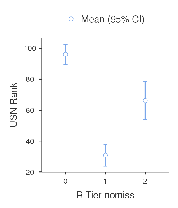
A program affiliated with a tier 1 university has a mean rank of about 31. For tier 2, that number drops to 66, and for the rest, it slides down to 96 (p<0.001). They are so intertwined that it’s easy to give the credit to the research tier when it actually appears to belong to the rank.
Testing Collinearity
Are they so intertwined that they are affecting the model? It would be good to check. We can look at collinearity statistics, which are presented in the table below. the VIF is telling us how crowded the party is, or how much one variable might be overlapping with a neighbor variable. Ideally, we want that to be under 2, which is how all of them fall in this model. The other piece is tolerance, which looks at how much the variables are independent of each other. This is important because one of the big assumptions made when building a regression model is that the variables are independent. Ideally, we want these to be above 0.5, and we can see that they are in this model.
| VIF | Tolerance | |
|---|---|---|
| Program Age | 1.55 | 0.646 |
| 1st attempts | 1.21 | 0.825 |
| USN Rank | 1.95 | 0.514 |
| R Tier nomiss | 1.25 | 0.802 |
| 4 Years | 1.15 | 0.873 |
There are some other diagnostic tests of the model that I looked at to see whether it was a good fit, but I won’t bore you with those details (at least this time). Just know that we’ve built a pretty good model.
Real-World Projections
How do these results translate into the real world? Projecting this data forward, this table highlights how a few different ranks would correspond to pass rates based on the regression results. A drop of around 40 points in rank is associated with an almost 10% decrease in pass rates.
| 95% Confidence Interval | ||||
|---|---|---|---|---|
| USN Rank | Marginal Mean | SE | Lower | Upper |
| 28.0⁻ | 88.2 | 2.01 | 84.3 | 92.2 |
| 68.0μ | 76.9 | 1.19 | 74.5 | 79.2 |
| 108.0⁺ | 65.5 | 1.90 | 61.8 | 69.3 |
| Note. ⁻ mean – 1SD, μ mean, ⁺ mean + 1SD | ||||
Takeaways
I know this might ruffle some feathers with the “rankings don’t matter” crowd in the pharmacy world. I realize that a single model can’t capture the entirety of a student’s experience or potential. This analysis was a “pet project” meant to satisfy my own curiosity, not a definitive judgment on any single institution. Choosing a pharmacy program is a deeply personal decision involving many factors such as location, cost, culture, and clinical opportunities. However, all else being equal, this and some of the other factors from part 1 may be worth considering for a prospective pharmacy student trying to narrow it down to one program.
I also hope this made statistics a little bit less scary. Whether it’s analyzing national board rates or just tracking your own “off-label” hobbies, data can hold new insights to things you might already be asking yourself, and the real fun is in uncovering some answers.

Leave a comment